A consistent letterhead speaks volumes about your business. It projects your professionalism and concretizes your brand. It sets you apart from the competition. That’s no small feat for business owners — whether you’re a lawyer, an accountant, or a human resources specialist. So what makes a good letterhead? What can you do to make the most of those all-important letters that you’re sending to clients, colleagues, and other companies? Here’s our advice on building a better letterhead:
Integrate Your Brand
First thing’s first, your brand should be an integral part of your letterhead. If you have a company logo, include it in your design — in fact, it’s best to start by orienting your logo on a page first, then building the letterhead around that emblem.
Where to Orient Your Logo
Think of your brand as a focal point. Often, logos are oriented in the corners of a page, or centered, depending on the desired effect. A centralized logo portrays professionalism. You might consider a centered logo if you’re a doctor, lawyer, etc.
Offsetting your logo is a bit more “playful”, and that can be just as powerful for design firms, businesses that sell clothing, and other creative companies. Regardless of the placement of your logo, consider orienting it at the top of the page — after all, it is a letterhead. Your logo is the first thing that letter recievers will see, so it makes sense to use the head of the page. You should also consider the content that will be placed on the page when you are orienting your logo on your letterhead…
Consider Content
If you’re sending letters that are full of a thick block of text, then it’s best to keep the logo small, and it may be easier to keep the logo off to one side, for space’s sake. On the other hand, if your letters are brief, your logo can dominate more of the page. Estimate the average amount of content that you usually produce on a given letter, and design your letterhead accordingly.
Color
Next, you should consider the color of other design elements of your letterhead. If you have other graphic elements that you’d like to incorporate into your letterhead (perhaps bold, Helvetica® text, an image, or a graphic design), then you can opt to utilize the same color palette as your corporate logo. Or, if you think that color is too much for your letterhead, you can opt to stick with black for any graphic elements that you’d like to add to the page; black is timeless, it won’t steal focus from your logo, and it always looks good on a crisp sheet of paper.
Think Simple, Yet Effective
It’s easy to go overboard on your letterhead design. While you may have complex design ideas in mind, remember that simple is effective. Keep your color pallette to one or two colors. Leave plenty of white space to give the content more power. And avoid using and overly elaborate logo (you can simplify your logo for your letterhead if you already have a corporate logo). If you have a letterhead that’s gaudy, it will distract from the message of the letter itself.
Formatting Your Letterhead
At the same time as you’re orienting your logo and graphic elements, you should consider the formatting of the content itself. Where will you place your address and personal information? Where will the bulk of the content go? How will that content be formatted? Did you leave room to add a signature? Remember, the goal here is to craft a document that is clear, professional, and pleasing to the eye. Be sure to consider the white space of the page, and strive to strike a balance between this blank space, your logo, and your graphics.
Consider Integrating Text
As we mentioned, you may want to integrate text into your standard letterhead. This an especially modern approach that’s reserved for more creative designs, and therefore, more creative firms. An architecture firm, for instance, may forgo their logo to include big block letters that bleed to the edge of the page. You may include a quick concise statement, or a word that encapsulates your company’s values. That same architecture firm might leave out the logo, and insert a bold statement of their process: Think. Design. Build. If you want a striking, attention-grabbing letterhead, bold text may be the way to go. Or, if you have a traditional company with classic values, you can stick to a simple, tasteful logo.
The Finishing Touches
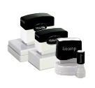
Adding a personal touch to your letters can have a huge impact on your readers. Add a stamp near your signature to create a more visceral impact — your readers will note that you took the time to sign and stamp their letter. You might opt to buy a stamp that simply says, “Thank You” for a personal touch. Or you could invest in a stamp that has your business logo etched on it, if you’re opting to leave your logo out of the printed letterhead design. This tiny finishing touch has a huge impact on the value of your letters and how they are perceived by their readers. Plus, it only takes a second to stamp a page.


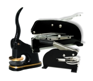
Similarly, you can emboss your letters, or their envelopes, to render the same effect. Again, embossers add a more visceral feel to your message. Your reader will be drawn to the feel of the embossed paper. And if you emboss the envelope, it’ll have a positive impact even before your reader breaks the seal.
Speaking of seals, the final finishing touch could just as well be a wax seal. This timeless addition is the perfect way to turn your letter into a finished product. Your recipients will cherish opening a wax-sealed envelope. A wax seal adds authenticity to your business, and it further boosts the impact of your message. Opt for a wax stamp with your company logo, your initials, your motto, a greeting — you name it. Regardless of the seal you choose, it’s sure to impress your letter’s recipient.

Make an Impact With Fred Lake
Here at Fred Lake, it’s our business to make your business impactful. We sell products that amplify the image of your company. Count on us for embossers, seals, stamps and more. You can view our full catalog of custom rubber stamps, embossing seals, namebadges, corporate kits, notary supplies, awards, recognition gifts and more. Count on Fred Lake to make a lasting impression.
